Bits of Food
These visualizations were created as a final project for CS171 (Data Visualization) at the Harvard Extension School.
The data to support this project is available through the Food and Agriculture Organization of the United Nations ("FAO") data portal.
🌸 Click the thumbnail below to view the visualization site! 🌸
Bits of Food aims to provide a data driven view of Africa's food production and food supply in the context of different social, environmental and economic factors. Our hope is to create an interactive tool that would provide interested parties with multiple entry points to the data, and a means to discovering potential concerns or relevant trends. Generally, global food production, population, emissions and trade values seem to be increasing, and we compare these patterns across the African continent with worldwide trends. While acknowledging the limitations of the particular data set that was available to us, we hope to create a tool that could surface patterns and discrepancies to be further investigated.
👈 Click the thumbnail to the left to go to the interactive site! 👈
Final Project Visualizations
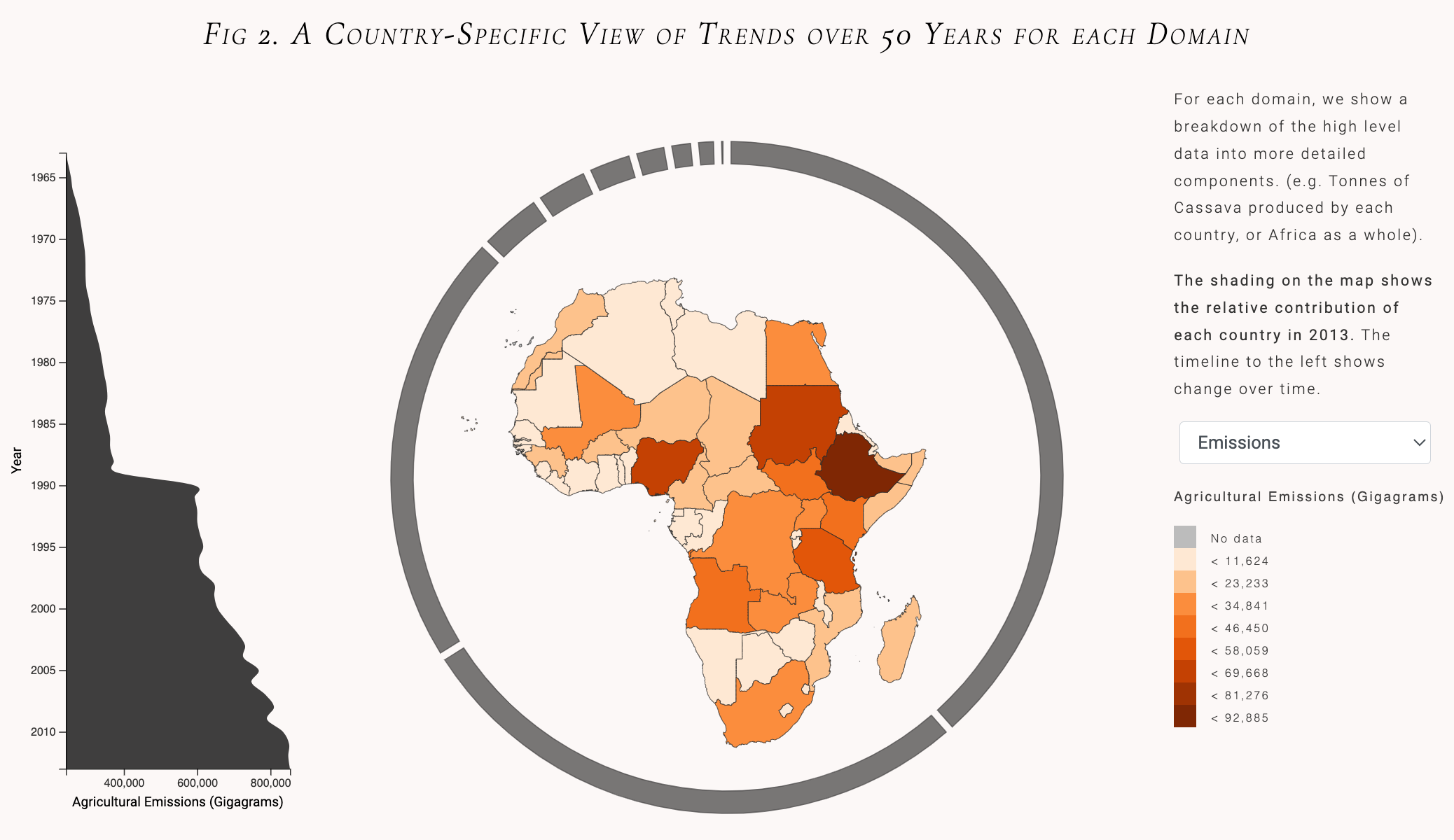
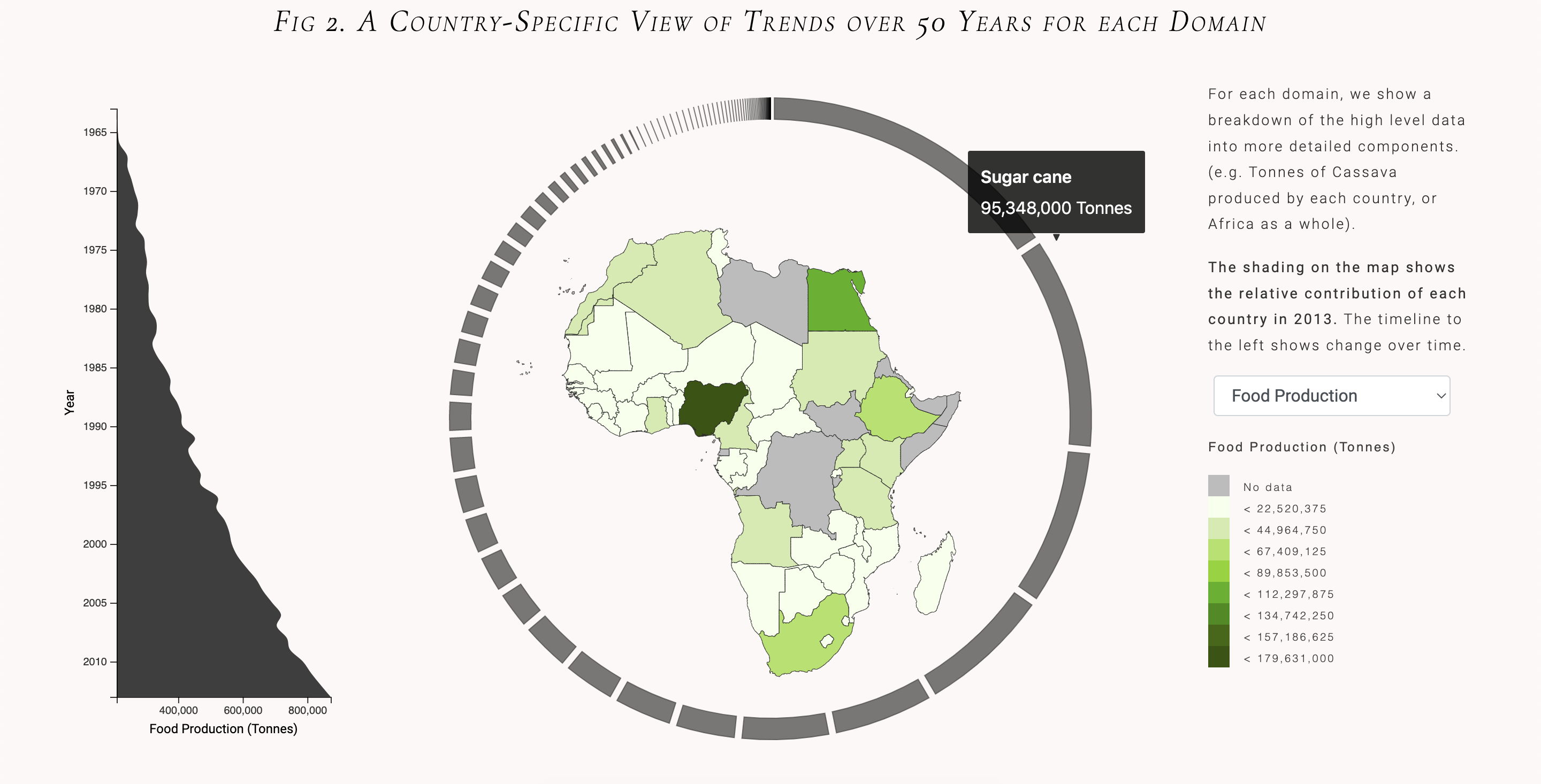
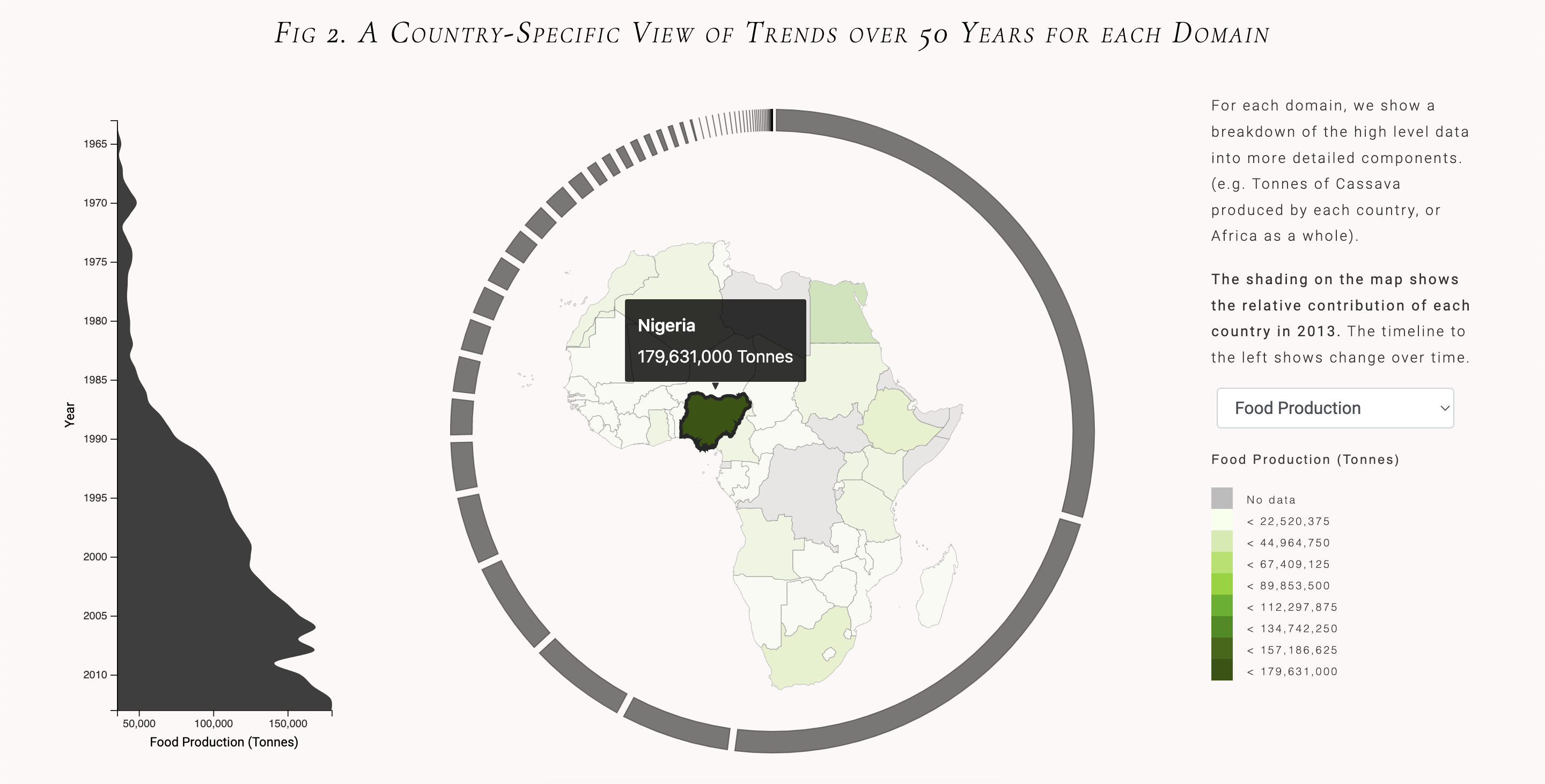
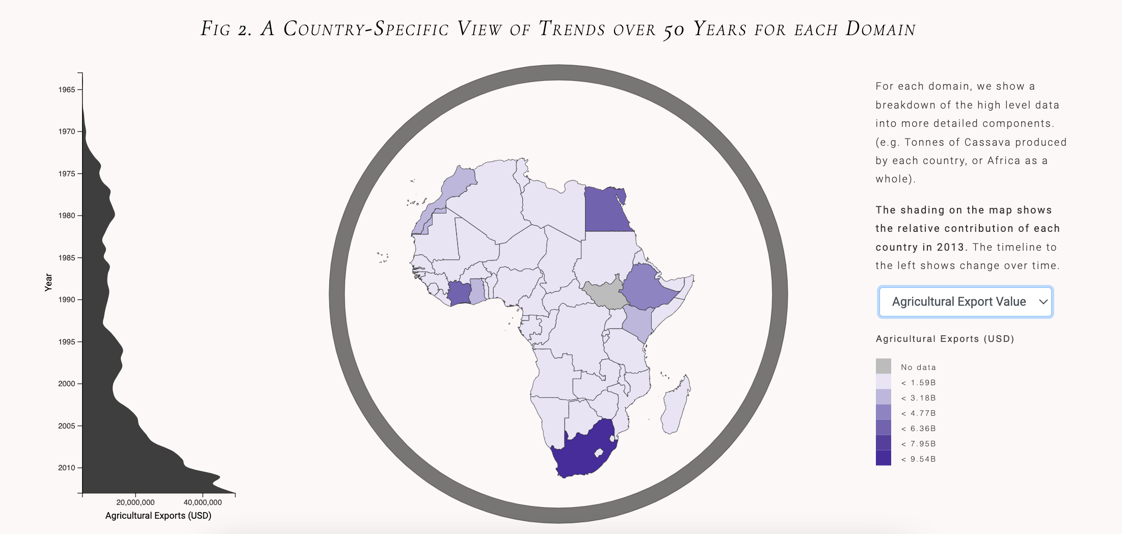
A Country Specific View of Trends Over 50 Years
A choropleth map to show an in depth view of the four domains for each country in Africa. The shading on the map represents the relative contribution of each country in the year 2013, and the area graph on the left shows the growth of each domain over time (eg. the growth of yearly food production in a 50 year span from 1963-2013). The arcs surrounding the map show a breakdown of each domain in 2013 (eg. total food production in different categories). In the initial view, the area graph, map, and arcs show aggregate data from across the entire continent of Africa. Clicking on a country will update the visualizations to show data from that specific country.
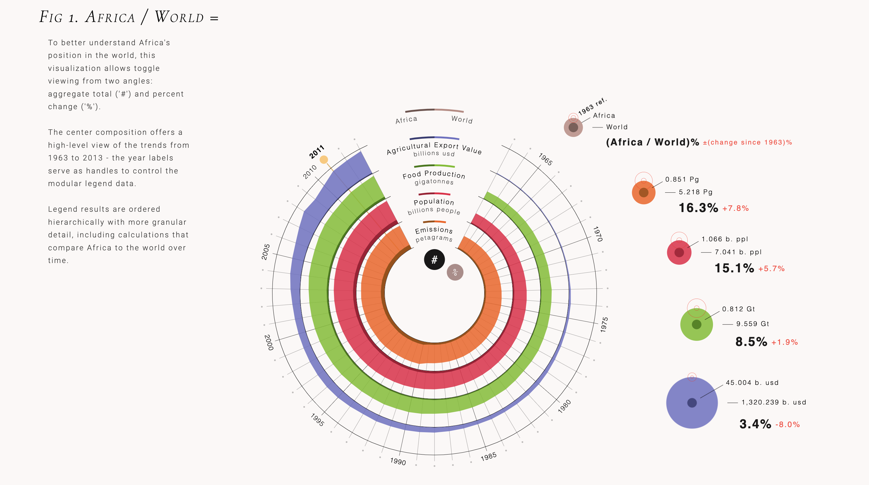
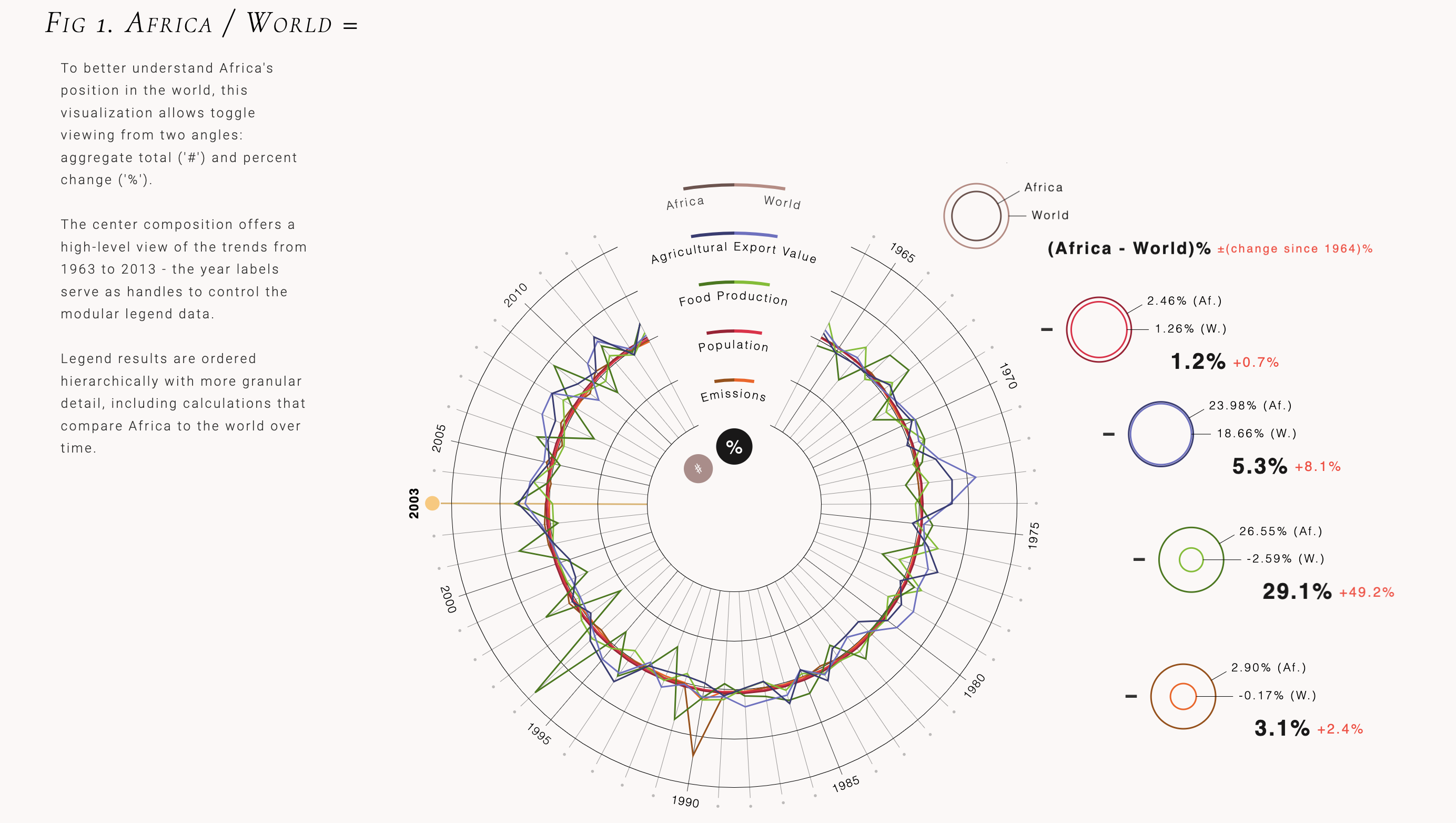
Africa's Position in the World Over Time
To better understand Africa's position in the world, we show high level trends of four domains - population, food production, trade value, agricultural emissions - since the 1960s in Africa versus the world. The center graphic shows Africa's contribution to the world in raw values (toggled with the # sign), and in rates of change (toggled with the % sign). The legend to the right compares the raw values from Africa with worldwide values for each domain, and also shows Africa's share of worldwide values as a percentage. Hovering over each year updates the data values for that year in the legend, and orders it top to bottom. Clicking on a single domain also highlights it in the central timeline.
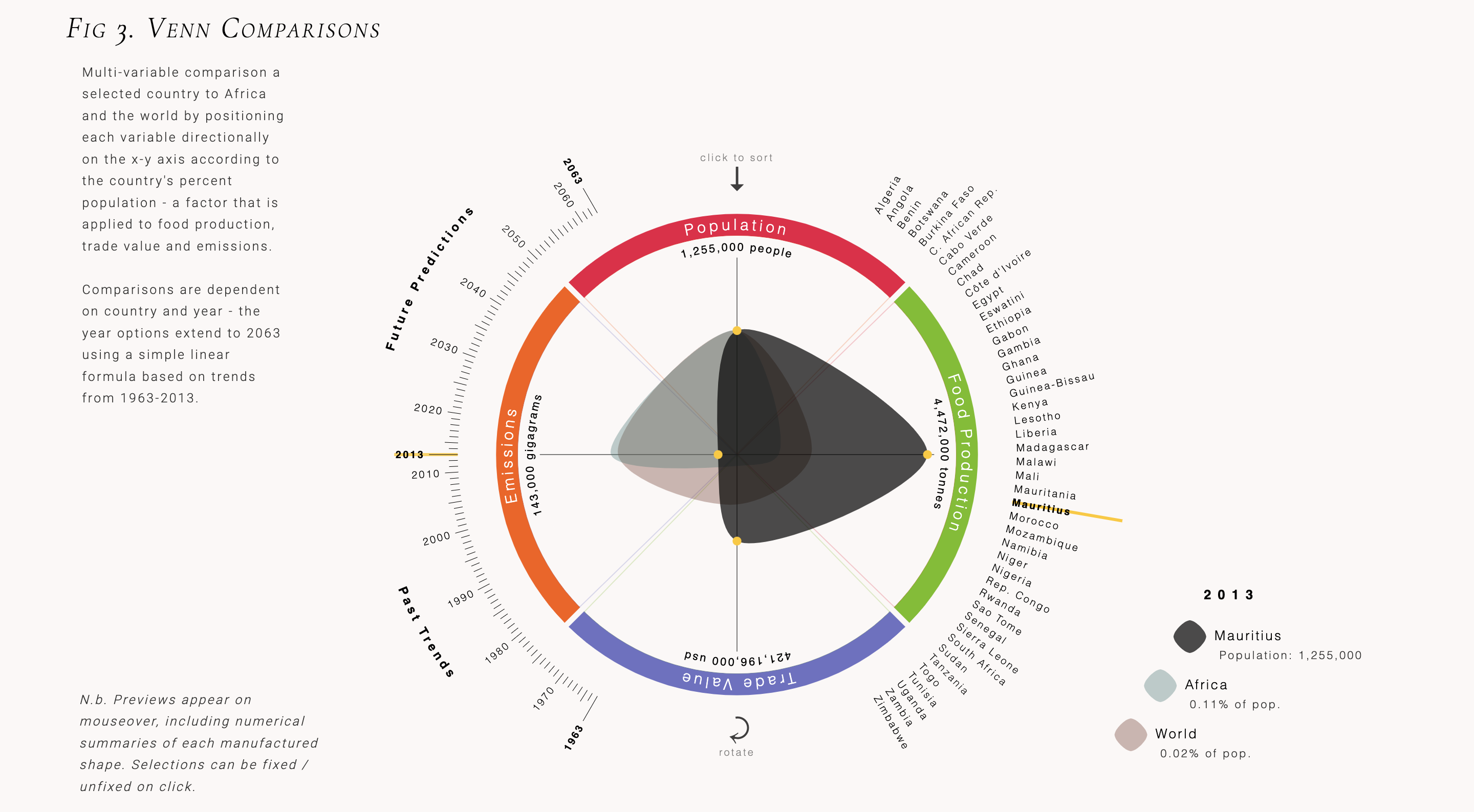
Multi-variable Comparison of Specific Countries to Africa and the World
The third figure aims to highlight imbalances in each of the four domains relative to each country's population. For example, clicking Botswana and then clicking the year 2013 shows that Botswana had a higher volume of emissions for its population relative to the world and the African continent as a whole, but a lower volume of food production in the same year. To drill down deeper, you can hover over the forms in the center of the ring and the raw values will appear along the inside of the ring.
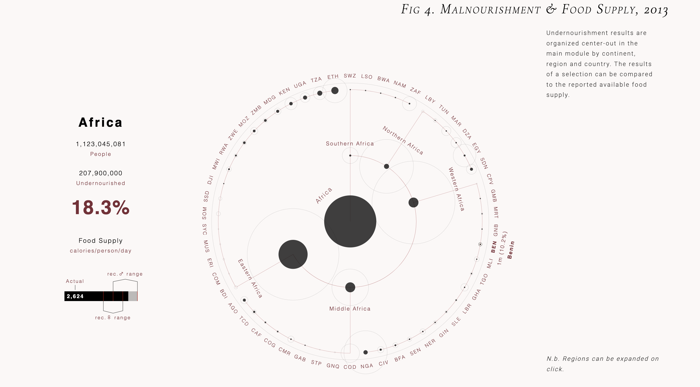
Malnourishment in Africa by Region and Country
The last visualization seeks to introduce another dimension for understanding Africa's food supply, showing malnourishment levels for each country sorted by region. Interestingly, although overall level of calories available per person per day seems to be within the recommended ranges, malnourishment is still quite high in several of these countries. This could indicate that much of the food that's produced is not actually available for local consumption. Of course, there are many other factors at play that are not captured by the available data set, but this is just one example of a pattern surfaced by our tool that could signal a need for further investigation.
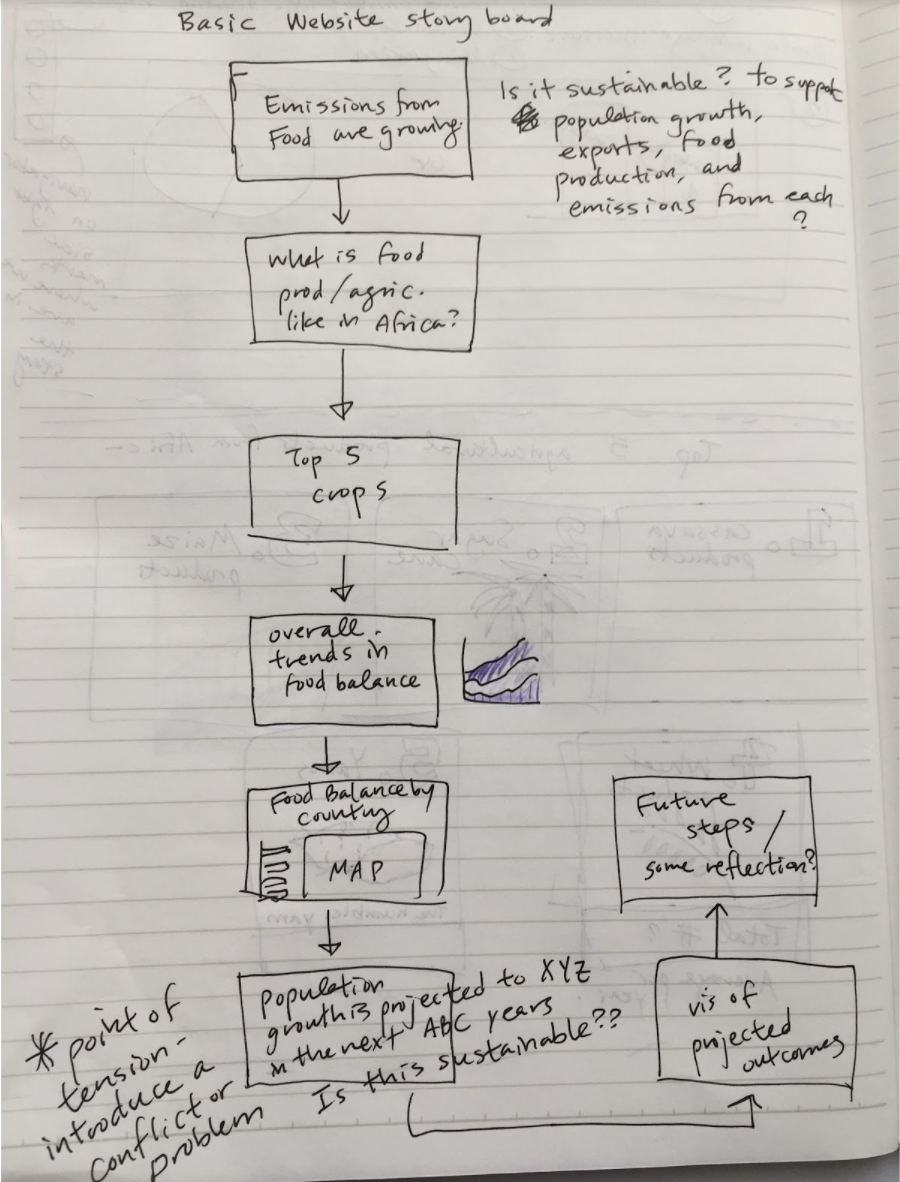
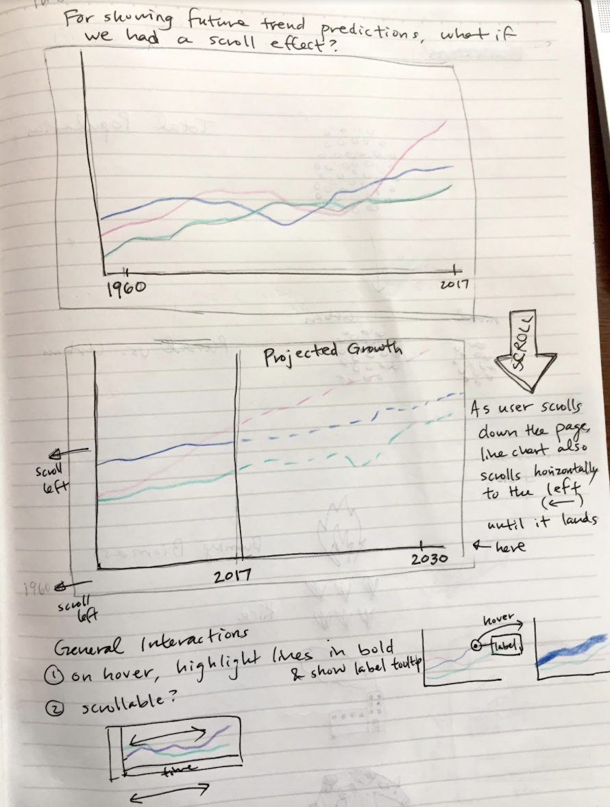
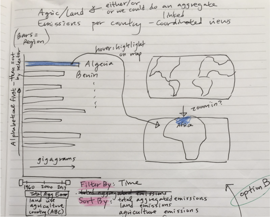
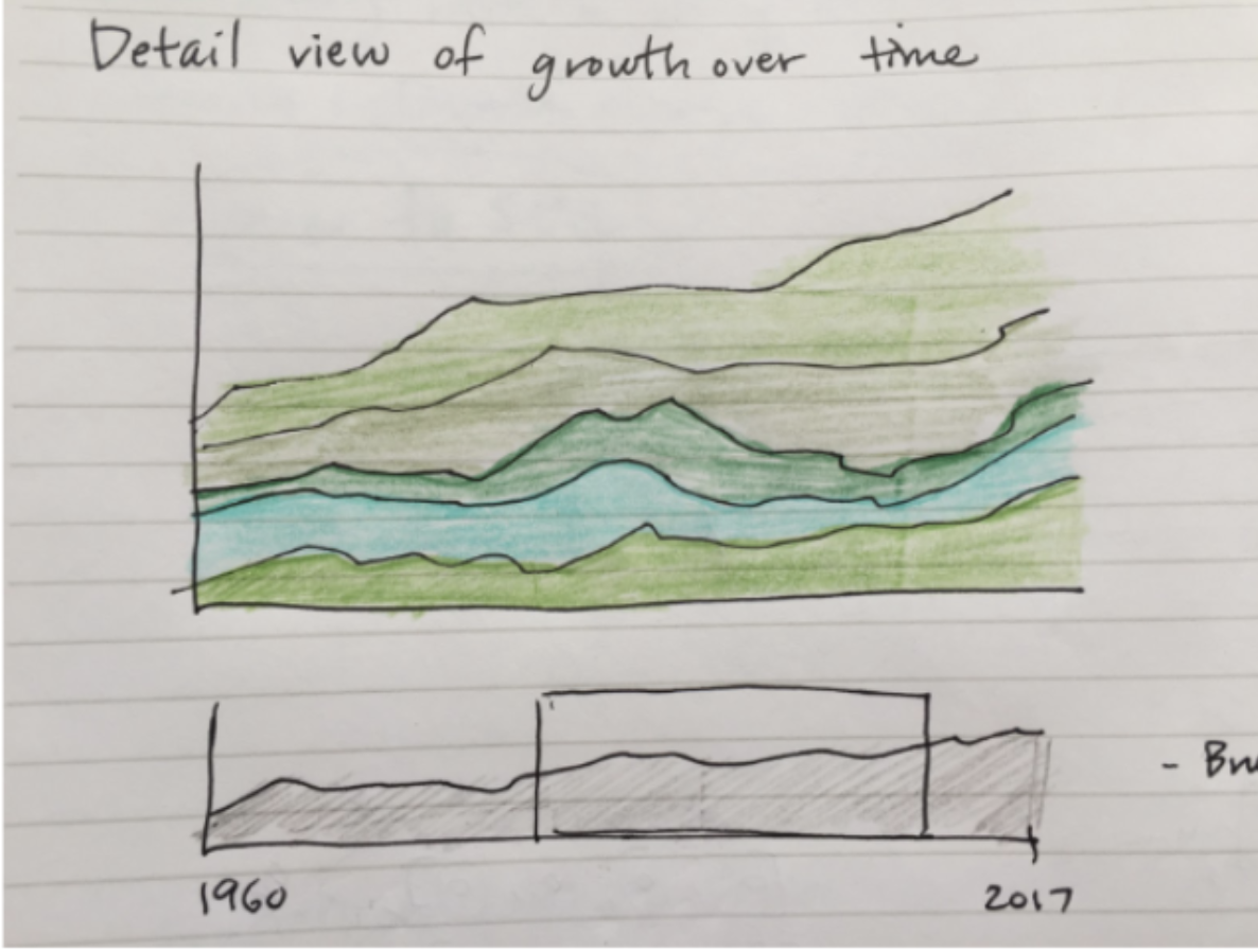
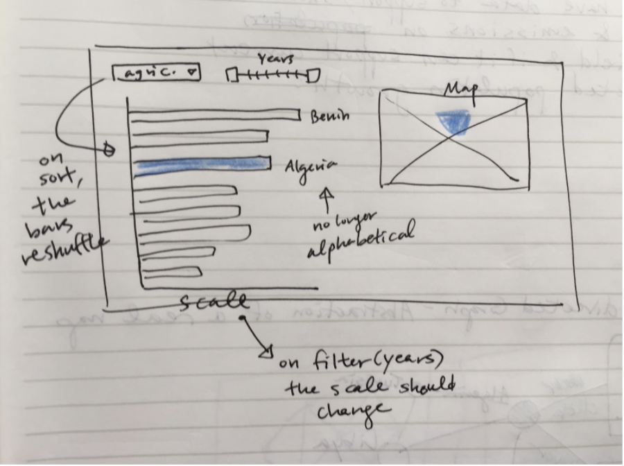
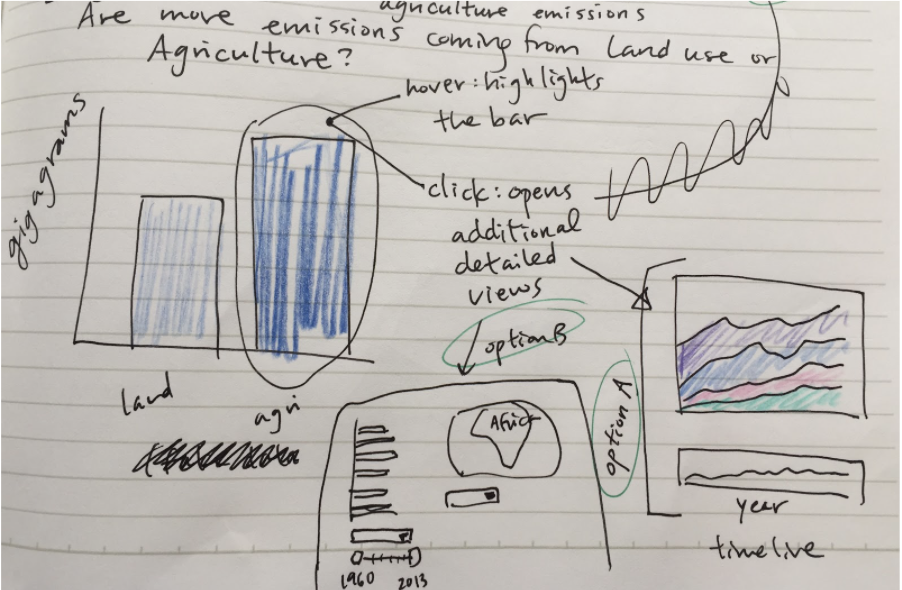
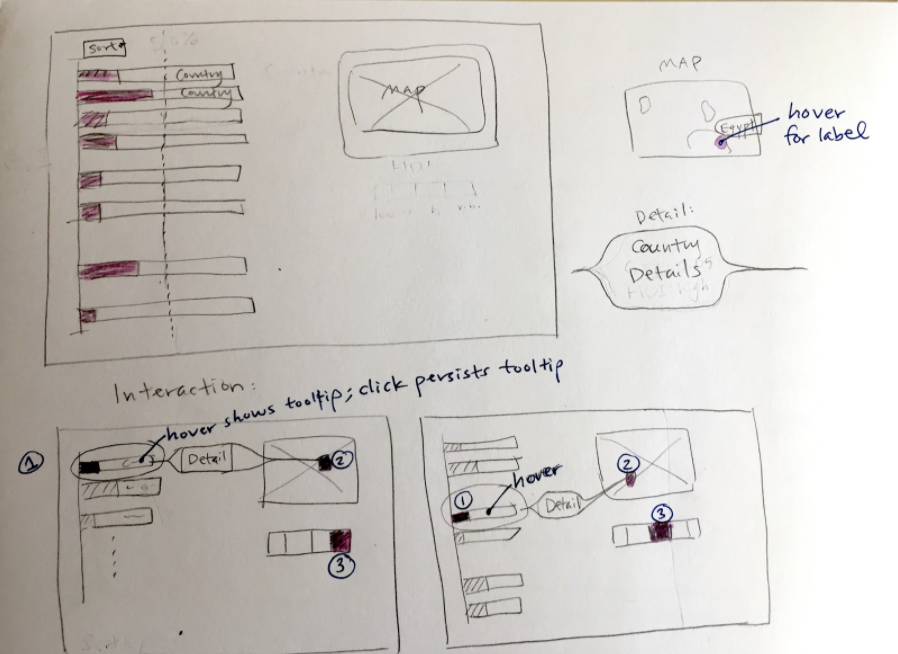
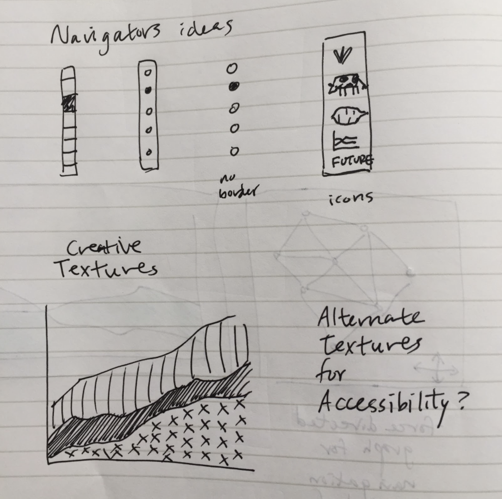
Process photos: